GoodTimes
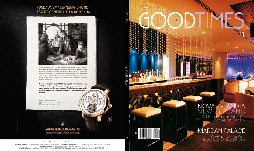
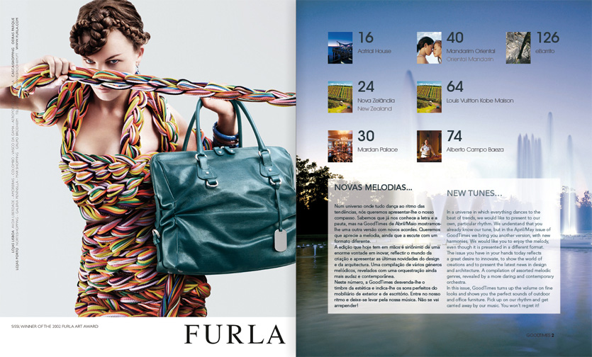
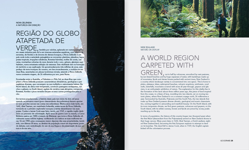
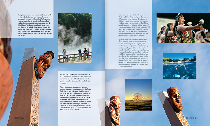
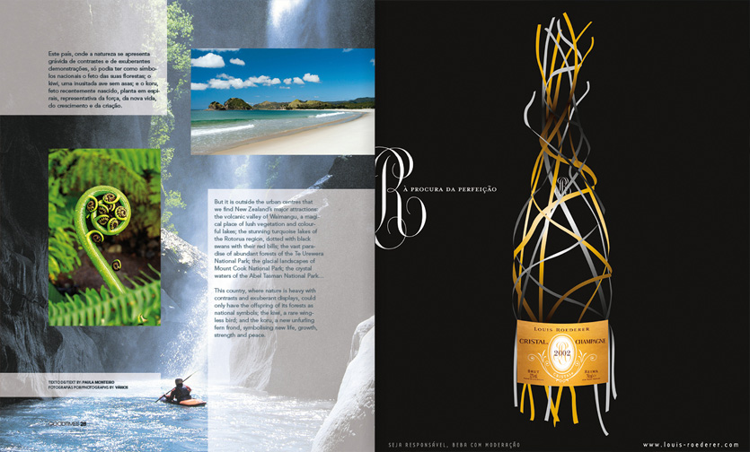
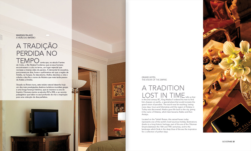
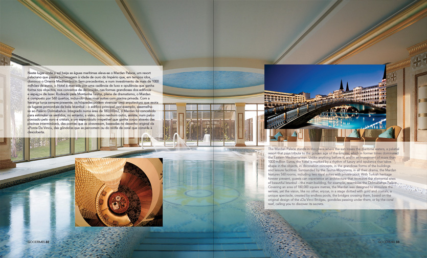
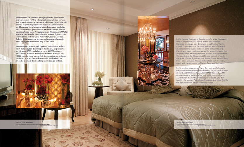
Little editorial design project for a bilingual travel magazine called GoodTimes. It consists of a cover, summary page and two articles.
It has two typefaces in total. The magazine body shows two languages – Portuguese on the left and English on the right (slightly faded). There are large uppercase paragraph headlines, making it really stand out. The images helped providing the text with a voice.
